On this page
Sketching on iPad has become a practical workflow for artists, students, and designers who want portability without losing creative control. With the right settings and a consistent practice routine, you can make line quality, shading, and spacing feel natural. This guide explains how to choose tools, optimize your app and stylus behavior, and build a repeatable process for better results. You will also learn how protective layers and display settings influence comfort and precision.
- Introduction
- Pros & Cons of Sketching on iPad
- Step-by-Step Practical Guide
- How screen protectors support sketching
- Wrap-Up
- Q&A Section
- About the Author
Introduction
Sketching on iPad is an efficient way to combine ideation, drafting, and visual storytelling in one compact device. It is especially valuable when you need quick capture of ideas, fast iteration, and easy organization of your work. Compared with paper-only workflows, digital sketching can reduce friction between concept and refinement through undo, layers, and export options. At the same time, you can still develop a traditional drawing discipline by focusing on fundamentals such as stroke consistency, value control, and composition.
In this article, you will learn a practical approach to improving results with sketching tools on iPad. You will also understand what to adjust for comfort, accuracy, and creative flow, including display surface considerations and protective choices.
Pros & Cons of Sketching on iPad
Advantages
- Immediate iteration: Redo, adjust, and experiment without rebuilding a full page.
- Layer-based workflow: Separate line work, shading, and color for controlled edits.
- Portability: Carry a sketch environment that fits into a bag.
- Organized files: Search and manage projects with consistent naming and export.
- Flexible output: Export for sharing, printing, or client review.
Limitations
- Learning curve: Stylus feel, brush behavior, and app settings require calibration.
- Display sensitivity: Glare, reflections, and surface texture can affect perceived control.
- Brush selection complexity: Too many options can slow down decision-making.
- Power and storage: Long sessions may require charging and space management.
Step-by-Step Practical Guide
Choose hardware and input tools
Start by selecting a setup that prioritizes consistent input. A compatible stylus matters because response speed and pressure detection shape your mark-making. If your workflow involves frequent travel, choose a configuration that supports long note and sketch sessions without interruptions. Also plan for a comfortable stance: stable hand placement and a consistent viewing angle reduce fatigue and improve line confidence.
Next, consider your intended drawing style. If you focus on thin ink lines, prioritize tools that offer reliable pressure gradation. If you focus on sketch silhouettes and shading, ensure the display brightness and pen behavior support smooth coverage. This step is not about buying the most advanced option; it is about creating repeatable conditions.

Diagram of pen pressure changing line width
Select an app and configure core settings
Your results will depend on your app settings as much as on your skill. Begin with a small set of defaults that you can keep consistent across sessions. Focus on three areas: canvas setup, brush behavior, and navigation controls.
- Canvas size and orientation: Use a size that matches your typical subject. A consistent format helps you judge proportions.
- Brush smoothing: Moderate smoothing can stabilize shaky lines, but excessive smoothing may reduce expressiveness. Test a few levels and pick one that aligns with your style.
- Pressure curve: If your lines feel too light or too dark, adjust pressure sensitivity. A flatter curve can help early sketching, while a steeper curve can support fine control.
- Undo and zoom behavior: Confirm gesture controls feel natural. Frequent navigation interruptions break creative rhythm.
After configuration, create a small brush library. Select a pencil-like brush for blocking shapes, an ink-like brush for final lines, and one shading tool. Avoid adding too many brushes at once. A smaller library trains decision-making speed.
Use layers, brushes, and gestures strategically
Layering is one of the strongest reasons artists adopt sketching on iPad. Use layers to reduce erasing overhead and to isolate changes. A practical structure is line layer, shadow layer, and notes layer. Keep early gestures on a sketch layer so you can revise without risking finished marks.
Adopt a simple gesture strategy. Use zoom for detail work, but keep it limited during the first pass. Over-zooming can distort your sense of scale. During layout, stay at a comfortable view level and allow the composition to guide proportion decisions.
Brush choice should follow intent. Use a light, responsive brush for exploratory strokes and a more stable brush for edge definition. For shading, focus on stroke direction. Consistent direction makes gradients look intentional rather than accidental.
Improve line quality and shading control
Line quality improves when you manage three variables: stroke speed, pressure, and pause planning. On iPad, you can train line confidence by drawing fewer, longer strokes. Instead of sketching many short segments, aim for guided strokes that begin and end with purpose. If your app supports stabilization, treat it as a training tool rather than a crutch.
For shading control, practice value stacking. Start with midtones, then add darker accents and lighter highlights. When you rely on contrast too early, the sketch may flatten. Conversely, when you delay dark values, the form can look incomplete. A balanced approach is to block values in broad strokes and then refine edges.
Finally, pay attention to edges. Many beginner drawings look flat because they treat every boundary as the same sharpness. Use at least three edge types: hard edges for focal points, soft edges for transitions, and lost edges where values merge. This technique can transform a digital sketch into a more believable form.

Stacked value blocks forming a smooth gradient
Adopt a focused practice plan
Consistency matters more than complexity. Use a short practice structure that repeats across sessions. A durable plan can be designed around warm-up, study, and output.
- Warm-up (5–10 minutes): Draw circles, straight lines, and gentle curves using one pencil-like brush. Aim for uniform pressure and steady speed.
- Study (15–25 minutes): Practice one subject or one skill, such as perspective lines or a single lighting direction.
- Output (20–35 minutes): Create a finished sketch that applies your study. Keep it focused on a clear objective, such as bold silhouette or clean value range.
Track what you change. If your lines improve after adjusting smoothing, note the setting. If shading looks blotchy after switching brushes, record the brush and texture behavior. This approach turns sketching on iPad into a measurable skill-building system.
How screen protectors support sketching
Display surface conditions influence comfort and perceived control. Some artists prefer a textured surface because it can improve glide and reduce slipping during longer sessions. Others prioritize a smooth surface for fast motion. The key is to match your stylus behavior to your hand habits and visual needs.
One practical consideration is glare reduction. Reflective screens can make it harder to judge contrast, especially under bright lighting. Additionally, anti-reflection and texture design can support a more consistent view, which helps when you evaluate line work and value separations.
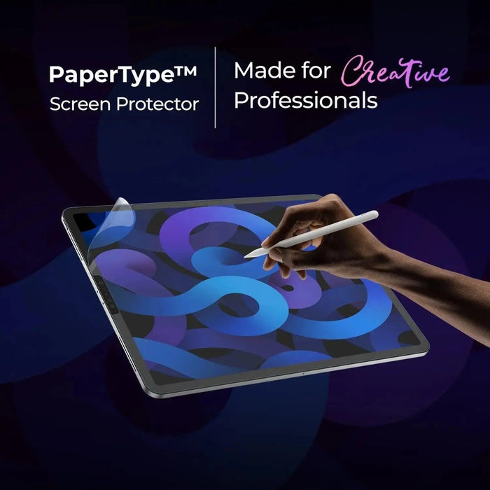
Below is a specific product example that many creators use to support sketching and writing tasks on iPads:
PaperType® Screen Protector - Perfect for Sketching, Writing, and Note-taking on iPads
PaperType® Screen Protector details
Product choice should align with your drawing goals. If your strokes feel too slippery, texture-focused options may help. If you frequently sketch in bright environments, anti-reflection properties can improve visibility. For creators who sketch and write often, a protector designed for tactile feedback may also reduce hand strain by encouraging controlled motion.
Regardless of the protector you use, evaluate fit and installation quality. Bubbles, dust, or misalignment can create distraction and affect stylus tracking feel. After installation, spend a short time testing your pressure behavior and brush response so you can adjust your settings if needed.
For additional accessory options tailored to Apple devices, you may explore related cases and protection categories on the Moarmouz catalog, including anti-glare screen protectors and iPad covers.
Wrap-Up
Sketching on iPad can deliver a highly productive workflow when your tools, app settings, and practice structure work together. Start with a reliable stylus and comfortable setup. Configure your drawing app for consistent brush behavior, pressure response, and navigation. Then train line confidence with longer strokes and deliberate pauses, while improving value and edges through repeatable shading methods.
Finally, treat the display surface as part of your creative instrument. If glare and glide issues disrupt your work, consider a protector that supports tactile feedback and contrast evaluation. With steady practice and small setting adjustments, you can build a personal workflow that improves steadily over time.
Recommended next step: Choose one app preset and a small brush set today, then complete a short session using a warm-up, a focused study, and one finished sketch output.
Q&A Section
Is sketching on iPad realistic for professional work?
Yes. Many professional workflows use tablets for ideation, storyboarding, interface sketches, and iterative design. The deciding factors are consistency, your comfort with the stylus and software, and your ability to apply disciplined fundamentals such as proportion, value control, and edge planning.
How can I make my lines feel smoother without losing character?
Use stabilization and smoothing in moderate amounts. Train with slower, longer strokes and a limited brush set so you learn how each tool behaves. If smoothing reduces expressiveness, lower stabilization first, then adjust pressure response or brush dynamics to keep the feel you want.
What should I adjust first when shading looks blotchy?
Start with the brush. Reduce opacity or change blending settings if your app uses them. Then review your stroke direction and value plan. Many blotchy results come from mixing multiple directions too early or placing dark values before midtone structure is established.
Does a screen protector change stylus performance?
It can. A protector can alter glide, perceived friction, and visibility of contrast under different lighting. After installation, test pressure response with your main brush and make small setting adjustments so your workflow stays consistent. If you use anti-glare features, also evaluate whether reflections reduce during your usual sketching conditions.
About the Author
Moarmouz
Moarmouz is a digital-creation specialist with expertise in tablet-based workflows, drawing UX, and creator-focused accessory guidance. The experience behind this article focuses on practical setup decisions that help artists build stable routines rather than chasing complicated settings. For readers starting today, the goal is simple: refine your process step by step and draw consistently.